PARI
PARI
PARI
Industry
Sports entertainment
Sports entertainment
Brand
PARI
Agency
In-house brand team | Shuka design bureau
Role
Brand Strategy Lead (in-house)
Year
2024


Project Description
PARI is a sports entertainment brand built around live sports, matches, promotional mechanics and fan engagement. The task was not just to update the visual language, but to translate a new brand platform into a system that enhances the sense of involvement, preserves the brand’s key assets and works consistently across channels, reflecting the company’s next stage of development.
Together with the team and design bureau I worked on the brand strategy and platform, defined the strategic framework for the future identity and identified the visual territory that best expresses the brand’s new meaning. My role was to ensure the system was not only expressive, but also clear and scalable across digital communications, brand image materials, promotional formats, match announcements and CRM.
Background
Background
Background
Challenge
Challenge
Challenge
Strategy
Strategy
Strategy
Creative idea
Creative idea
Creative idea
Results
Results
Results


Starting Point. Fragmented visual landscape. The goal was to move from a visual mess to a connected brand language, while preserving the brand’s key assets: the signature arrow and the mint color.
Starting Point. Fragmented visual landscape. The goal was to move from a visual mess to a connected brand language, while preserving the brand’s key assets: the signature arrow and the mint color.
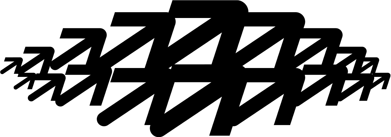
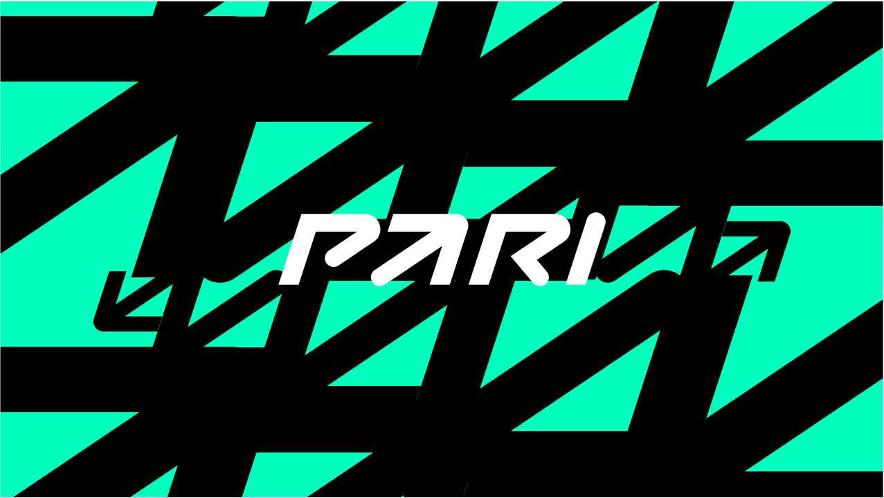
Visual System. Turning the arrow into a system: a recognizable brand asset became a flexible visual principle for unity and participation across different formats, using dynamic sports graphics built on optical effects, depth and movement.
Visual System. Turning the arrow into a system: a recognizable brand asset became a flexible visual principle for unity and participation across different formats, using dynamic sports graphics built on optical effects, depth and movement.


Graphic modes. The identity was designed with multiple visual modes, enabling it to adapt to various content types while maintaining consistency across both static and motion elements.
Graphic modes. The identity was designed with multiple visual modes, enabling it to adapt to various content types while maintaining consistency across both static and motion elements.


Graphic Language. The arrow evolved into a simple, dynamic graphic language.
Graphic Language. The arrow evolved into a simple, dynamic graphic language.

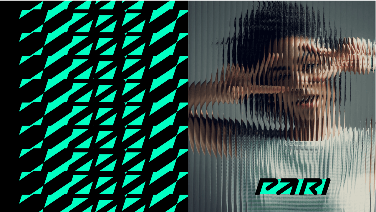


System in Use. The system translated into brand visuals keeping a consistent look while shifting across different formats and contexts.
System in Use. The system translated into brand visuals keeping a consistent look while shifting across different formats and contexts.